This year marks a little-known anniversary: 50 years since the 1964 Road Signs Regulations came into effect, on 1 January 1965, and introduced the standard signage system that we still know and love today. The designs have become classics, much copied or imitated around the world, with their now familiar black images on a white background and red border, plus direction signs in white on blue for motorways, white and yellow on green for ‘A’ roads, and black on white for others.
Izod’s Post
The first road signs in Britain, apart from Roman milestones, were “fingerposts”, quite literally iron or wooden representations of a hand with finger pointing in the direction of a town and giving its distance in miles. The oldest surviving example is thought to have been erected in 1669 and is known as Izod’s Post or the Cross Hands; most pubs named the Cross Hands are on road junctions and were named after such signposts, despite the pictures of Dick Turpin holding a pair of pistols across his chest.
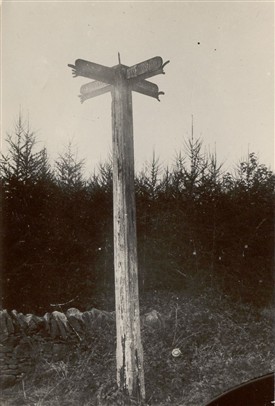 Izod’s Post was erected by either Nathan or Nicholas Izod, a local farming family, at the junction between what is now the A44 and B4081 near Chipping Camden. Incidentally it gives directions to Woster (Worcester) 16 Miles, Warwick 15 Miles, Oxford 24 Miles and Gloster (Gloucester) 18 Miles, but at a time when each county measured miles differently; in Izod’s day in the Cotswolds, they calculated a mile about one and a half times longer than today’s statute mile.
Fingerposts became widely used by the 1740s when turnpike trusts were encouraged to mark every mile, and in 1766 this became compulsory to help stagecoach and mail services keep to timetables. In 1773 the General Turnpike Act required trustees to erect signs informing travellers of the distance to the nearest town, and often to London.
Early signs for motorists
In the 20th century the earliest signs were erected initially by cycle clubs followed by the Automobile Association (AA) and the Royal Automobile Club (RAC), but with the Motor Car Act of 1903, the government passed responsibility for the provision of all traffic signs to local authorities.
 In 1921 the Ministry of Transport provided a model for direction signs which recommended standard 2.5 inch black upper case lettering on a white background and specified that the name of the authority should be incorporated into the design. Although now based on a common model, local authorities had considerable discretion and, as a result, each county’s signs retained their own distinctive character.
 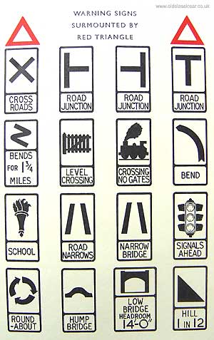 They were also designed in a time when average road speeds were less than 40mph, being often beautiful designs – I particularly like the ‘torch of knowledge’ sign for a school, and the carefully drawn traffic lights – but difficult to read quickly.
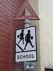
There were some changes just after the Second World War, for example in the ‘school’ sign.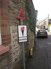
Motorways and the Anderson Committee
However British road signs were now outdated compared with those in Europe. With the building of Britain’s first stretch of motorway bypassing Preston (part of what is now the M6), the Government also realised that trying to read British signs at high speed – the 70mph maximum limit did not yet exist – was next to impossible, and potentially dangerous. A committee led by Colin Anderson, chairman of P&O, was set up in 1957 to design new signs for the motorway(s), appointing a graphic designer for the job: Jock Kinneir was one of Britain’s leading designers who also taught at the Chelsea School of Art, and he recruited one of his students at Chelsea, Margaret Calvert.
Jock Kinneir and Margaret Calvert
Kinneir’s and Calvert’s system was rooted in the concept of each sign taking the form of a map oriented towards the driver. Concluding that a combination of upper and lower case letters would be more legible than conventional upper case lettering, they developed a new typeface. Later named Transport, it is recognisably modern as a sans serif font, but it is softer and curvier than the blunt modernist lettering used on continental European road signs. Kinneir and Calvert felt that these qualities would make it seem friendlier and more appealing to British drivers. The sizes and spacing of letters, and a consistent way of indicating places and distances, were all specified and tested, before erecting the first signs for the opening of the Preston Bypass (M6) in 1958.
Worboys Committee and the 1964 Road Signs Regulations
Having set a standard for motorways, in 1963 the Government set up the Worboys Committee to look at improving and standardising signage for other roads. Kinneir and Calvert were appointed again, although by this time Calvert was now formally Kenneir’s business partner not just his assistant.
They decided to adopt the continental style of using pictograms rather than words on the road signs, and Calvert drew most of the pictograms in the friendly, curvaceous style of Transport. Many of her illustrations were inspired by aspects of her own life. 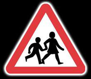 Eager to make the school children crossing sign more accessible, she replaced the image of a boy in a school cap leading a little girl, with one of a girl – modelled on a photograph of herself as a child – with a younger boy. Calvert described the old sign as being: “quite archaic, almost like an illustration from Enid Blyton… I wanted to make it more inclusive because comprehensives were starting up. . . The previous sign had a boy with a book and a girl behind him, and they weren’t holding hands,” she says. “This is a bit more caring; I switched it around and I based [the girl] on me as a child.”
Also, unlike previous government efforts to regulate signage which had tended to apply to new signs being erected, Worboys argued a modernist position of starting from zero, with all previous signs being deemed obsolete, requiring total and systematic replacement. As a result local authorities were charged with massive re-signage programmes. Order and Prohibition signs were almost all replaced within 2 years, with the warning and direction signs taking somewhat longer. Few pre-1964 warning signs survived more than about ten years. While direction signs were similarly replaced, more have survived as they were not deemed as essential as the others in regulatory terms.
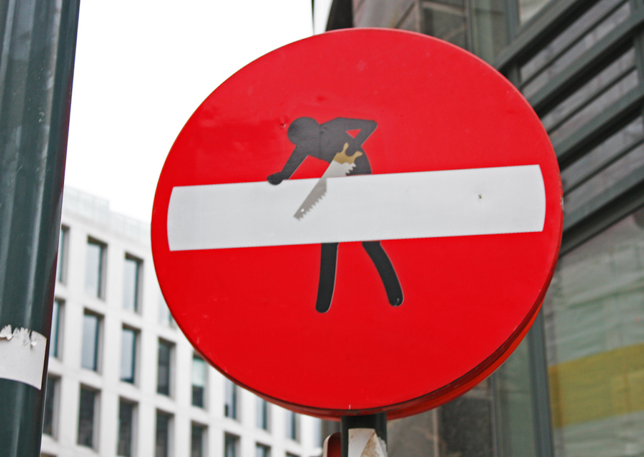
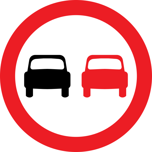
Calvert says of the project: “It wasn’t a fashion thing, we were designing for permanence… something that wouldn’t look dated in five or 10 years’ time.” In fact the signs they designed are still as fresh, modern and above all as clear as they were when they first appeared 50 years ago in 1965, even if we sometimes struggle to remember what they all mean. Here are some less well-known interpretations, for those without a copy of the Highway Code!


Richard Gibby